Final Graphic
FLYP Media: Getting Multimedia Journalism Right
One of the most engaging sites I visit for multimedia journalism is FLYP Media. I LOVE this site because it really allows the user to interact with the content without getting overwhelmed. The interface is simple and stays within the same package so you can view a ton of content without having a million browser windows open. The site combines multimedia journalism and creates a wonderful user experience. While the design at times isn’t the strongest component, it is noticeable that the creators are experimenting with what works best. Some of their older stories are still in a simple text/photo/video page format, but it does a good job of fitting the style of the newer content.
The navigation is simple and consistent. On the bottom you can scroll through the stories by clicking: view contents. This makes it more compelling as a user to stay longer on this site and also to return to it.
The effects on the site enhance the content instead of distract from it. Whether it be the hover states, sounds when flipping the “pages” or clicking an audio component, it simply works. The comment section is great because I expected it to take me to another page (annoying) but it just used jQuery to popup over the page. Also, you can watch videos from the photographers or writers that created the story. This is an added value that is definitely overlooked by many journalism sites. I wish that the “full screen” option would actually be 100% of my screen size. Again, I think the design struggles between making it too much for a print magazine instead of an online magazine. The color scheme works well for most stories but sometimes the typography doesn’t work as well. Also, I’d like to see the “FLYP contents” navigation drop-down change the opacity/transparency so it’s easier to read the type.
The best part? From what I can tell (not completely sure) is that the site used jQuery instead of Flash. Therefore it loads quickly (given the amount of content).
It seems to me that this site is one of the most innovative in packaging multimedia content. Although some of their decisions aren’t as successful as others, I think that FLYP is one of the closest sites to getting multimedia journalism packaging right.
Below is the link to one of my favorite stories (don’t click on it if you’re in a rush– it’s hard to leave). It does such of a great job of grabbing the user and making them feel as if they’re in NOLA (with the live music, video footage, photos, text).
Emily Stewart
Magnum Photos Multimedia: Between Heaven and Earth
It’s always been very hard for me to choose a “favorite” anything, and multimedia stories are no exception. For me, a compelling story is driven by emotional content and artistic decisions that hint at the essence of the subject matter but nonetheless keep you in suspense. I’ve always been a fan of Magnum Photos and have learned much about photography and the world, and recently found a multimedia piece that really blew me away.
Aspiring to tackle such ephemeral concepts as “pain and pleasure, humans and gods, spirit and body” and more, Between Heaven and Earth by Christina Garcia Rodero is clearly the product of many years of work. With this piece, Garcia Rodero plays photographer, journalist, storyteller, sociologist, and generally curious human, using photos to examine intense rituals and cultural manifestations around the world.

http://inmotion.magnumphotos.com/essay/between-heaven-and-earth
(Warning: There’s nudity)
Each photograph is symbolic and experiential: clear enough for anyone to make sense of but mysterious (perhaps context-less) enough to keep you guessing. The whole of the piece follows the music, which roughly divides by theme into ritual/spirituality, sexuality, death/suffering, bliss/reverence, and the exhilaration of being. Some of it is violent, gross, strange, and unnerving, but so interesting and thought provoking.
To me, truth in this piece is found not only in the documentary style of the images but also in the connections it makes between vastly different ones. What does Haitian Voodoo have to do with baptism in Eastern Europe or the Burning Man Festival in Nevada? As a multimedia piece, the sequence of images develops the “story” and the music sets almost a “cultural tone” for each short section of the piece. Amazingly, the entire thing is executed with very few words but somehow seems to be the most appropriate way to accomplish its overarching goal.
The video is part of the Magnum site, which has done a great job of organizing the work of dozens of photographers spanning decades. The multimedia section is fairly new, but easy to browse and very clean looking. The page containing the story itself is easy to use and inviting with its simple controls, curious image, and interesting description. One thing I noticed about the site in general was the use of color that is easy on the eyes and somehow fits their particular brand. The interface also uses simple usability clues (especially rollovers) to add a professional feel and help the user navigate.
I think one way to expand this already sophisticated project would be to allow the user to navigate more pictures from the various places the photographer has been, instead of looking at them just in a linear video format. As it is, multimedia is defined for this piece as combining separate sounds and images, but not from a user interactivity sort of way. I think that is a rut that many visual storytellers today remain in: they don’t develop ways for users to interact with the content besides just viewing it.
From a coding perspective, it seems that the video itself is put together in Flash, that it uses separate css for comments, banner styles, and layouts, and that there is jQuery (but I don’t know for what). The layout is solid and inspires me in the web design world as much as the content inspires me as a photographer. Beautiful.
Paul Mossine
Behind Bars Interactive Website
 Students from University of California, Berkeley worked on a series of stories about incarceration in the state for 10 weeks as part of the News21 project. The project is entitled Behind Bars: The California Convict Cycle and is a very impressive, in-depth look at the various aspects of life as a convict in California. I especially liked the portion of the project on desegregation. That is the part of the project I am featuring because I think it is a great example of using interactive design to engage the reader.
This story engaged me from the start because of the photo map at the top that allows me to find out more information about the people in the image and how they are interacting with one another. The reader can click on the little bubbles above people and get a short paragraph about the issue being addressed and then he/she can click on a link to a story that appears in the reader pane below the photo map. There are about 10 different short stories about different issues that the reader can look at by exploring the photo map and clicking on the links inside.
The reading pane also has extra information about legal aspects of the issue as well as statistics. They use graphics to display the information in a more appealing manner and they separate what some people would consider the boring aspects of the story to a different area. All of this makes consuming information easier on the reader. They also had a great audio slideshow that takes the viewer through images from the prison. That is one of my favorite aspects of the story and I wish the team would have displayed it a little bit more prominently.
I think this is a great way to engage the reader and to break up the content into chunks that are easier to consume than a large text story. The issue of desegregation in prison is hard to understand and using images is helpful.
Overall, this Behind Bars project is a fantastic example of investigative journalism and how journalists can use interactive web design to enhance their stories.
$pent: A Reality Check
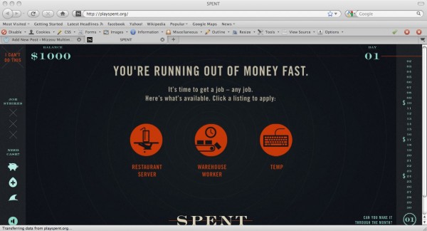
I really liked playing the game Spent, because it was a really good reality check into what it’s like to not have a job. It isn’t something that you really want to think about if you aren’t in that kind of a situation, but every day there are people out there who have to live that way.
I liked the really simple, straightforward layout of the game. At no point are you confused as to what you’re supposed to do. The game also does an excellent job explaining the consequences of every sacrifice and choice that you make. It clearly demonstrates that research went into this project, but it doesn’t overwhelm you with information. By organizing the facts and figures of unemployment into the steps of an interactive game, it not only made the information easier to digest, but it made it relevant to something you were actually doing, so that you understood it to a much more personal degree.
Making the information into a game was definitely a good idea, because it really brought it home for me. Most people who aren’t unemployed think on an abstract level that they would easily be able to rectify the situation. They think that if they just ‘get another job and don’t spend so much’ that they will be fine. But reality doesn’t work that way, and probably the best way to teach that to a large amount of people in a short amount of time is to make it into a game. It gives a whole new meaning to the idea of ‘beating the game’.
In the end, it gave me a lot more sympathy for those in the dire situation of unemployment right now. To me, it previously seemed like all of those people were a percentage on a page. But the game makes you realize in no uncertain terms that you could easily be one of those people, and the situation is worse than you could ever have imagined.
Qwiki: Experience Information
So, I recently came across this really cool multimedia site called Qwiki and thought its storytelling concept was brilliant. Although the quality of the audio and transitions between visual content can be improved upon, its approach to sharing information is both very innovative and very inviting to users.
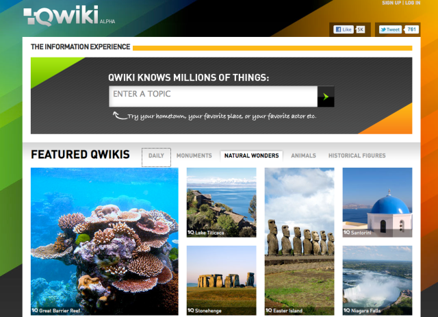
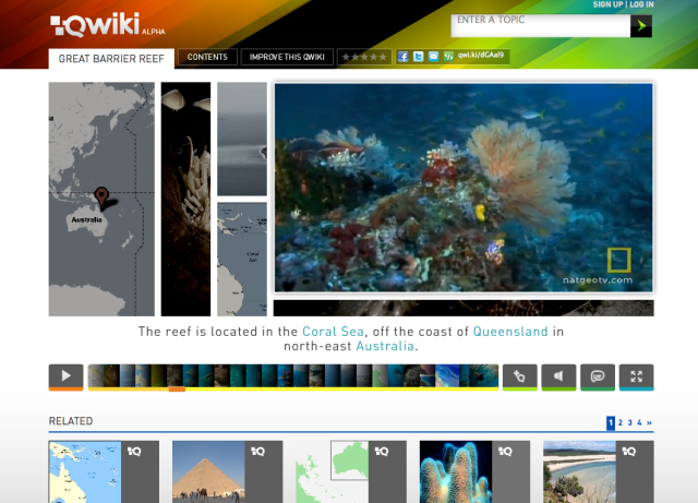
In its “About Us” section, the Qwiki team does a great job outlining this sites mission: “to forever improve the way people experience information.” How? Through storytelling, rather than through simple, readable searches. The team wants to create the experience of a professor, friend, coworker or family member telling you and me – the average person/user – about a topic we’re interested in. It’s like Wikipedia, but visual, auditory and quicker-to-digest content. For example, if I wanted to learn about Nelson Mandela, all I would have to do is type his name in the search box and a page with a short multimedia piece (a voice-over with pictures, graphics, maps, and the words in the VO itself) on Mandela immediately pops up. On that page is a timeline so you can see where in the story you are, a play/pause button, a very helpful related content button, and volume, subtitles and full screen buttons, each with their own color. As the story progresses, the images shift in accordance with the broadcast, “see dog; say dog” principle.
Qwiki has TONS of content. If you’re interested in learning about a country, actor, musician, monument, animal, social justice issue (human trafficking, wow, was so surprised and impressed when I saw content about this), natural wonder of the world, corporate brand — whatever — they’ve probably got information on it. And because the site is in its Alpha version, the Qwiki team invites users to “Improve This Qwiki” by suggesting photos and/or YouTube videos to include, along with an option to improve sound quality. (I actually submitted a suggestion for sound quality with the human trafficking Qwiki, as entire sentences were accidentally omitted from the VO. This was super easy to do, but I didn’t like how when I exited that screen, the multimedia piece started autoplaying right away.) So, not only is Qwiki a really cool, innovative approach to experiencing information, but also a great way to invite users in on the storytelling experience.
This above story on the Great Barrier Reef actually has National Geographic video incorporated in it. Awesome. I’d really like to learn more about their content sharing agreement. Perhaps Qwiki is operating under Fair Use laws, but my guess is those are bound to change over the next couple years.
Basically, Qwiki totally inspires me. It provides a creative, interactive and innovative approach to sharing and digesting information. It definitely achieves its goal of using storytelling to share information, rather than simple, traditional search. It also sparks some ideas in my own mind about how to design and develop a site for the multimedia organization I will be establishing through my master’s program. I’m excited to see how Qwiki continues to develop its content, establish corporate partnerships and how it will generate revenue.
What Happened to Pine Point
 One of my favorite sites we looked at in class this year was Welcome to Pine Point provided by the National Film Board of Canada. This is an unusual way of storytelling, but it really grabbed my attention. It’s movies, photos, graphics, information, and interviews brought together to create a memory of this town that has long been forgotten by its surroundings.
This was the first Web site I’d seen like this, something so eclectic I couldn’t get it out of my mind. It tells the story of Pine Point, a city in Canada that no longer exists. The narrator opens the story up, talking about the town he remembered once, and when he returned to see what had happened to it, he learned it was no more.
The site brilliantly uses graphics and sound that puts the viewer back in the time when Pine Point was a thriving industrial city centered around the local mine. The pictures are worn and yellowed as the 70s usually was for people. The music and noises give a vague perception of what it was like back then. Combined with the old movies and photos acquired, this site creates a real nostalgia for a place that is no more.
 The site does require time, and may not be something people are going to stay with if they are on a time crunch, but if the viewer wants to see a new and innovative form of storytelling, there is nothing not to like about this site. You do have to go along with the way the creators have laid out the story, but this isn’t necessarily a bad thing.
Being taken by the hand through this site is kind of nice because it really allows the story to engulf you. Perhaps, this is just my style of storytelling, but you can’t say that this site doesn’t create a haunting feeling of loss of a town that was never known.
Family Trees
New York Times’ Mixed America’s Family Trees was a really neat website I recently came across. Mixed America’s Family Trees offers a very creative method of defining America’s “mixed families” by offering colorful animation for the viewers to get directly involved in the storytelling of this piece.
Essentially, New York Times created this interactive graphic using Flash and Javascript to capture the true essence of “typical” American families — that they are quite multiethnic — contrary to common belief. The U.S. is a melting pot of cultures and it has been for decades. This publication recognized this and produced ingenious depictions of the concept, but put the power right in the hands of the audience. Talk about user experience and involvement, this website enables the viewers to sift through the family trees submitted by fellow viewers, as well as submit their own. The website would be non-existent if not for the contributed content. The site runs off of such i-reporter submissions.
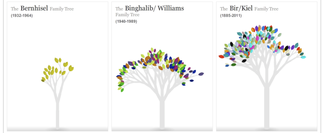
The design was simple on the homepage with the grid-like display of family members sectioned off by family name. The overall site is not text-heavy, which is something I would have actually preferred for context, but it draws my attention to the photos and the family names themselves. I think this is a great move, though, because seeing these family members is what’s more important than knowing their full names (full names would also risk releasing personal information.)
The animated trees are my favorite part. They have different colors of leaves for each ethnicity, appropriately attached to each family member photo representing their ethnic makeup. So, the more colorful the family tree, the more ethnic diversity in the family. It’s a beautiful and simple illustration that shows consistency in presentation of the very different contributed content.
Vogue Magazine Online
One multimedia site that I have always liked is Vogue Magazine’s online component. It has been recently redesigned and it is so much more functional than it used to be! The navigation bar across the top has categories that are the sections inside the print magazine, which is great for someone who is familiar with their print product. If a user was not familiar with the print product, that would be alright as well because they would be drawn in by their highly visual home page (below) and can scroll around until they find something that they are interested in. When clicking on any of the photos/stories below, the user is linked through to an interactive interior page that is unique to the story.

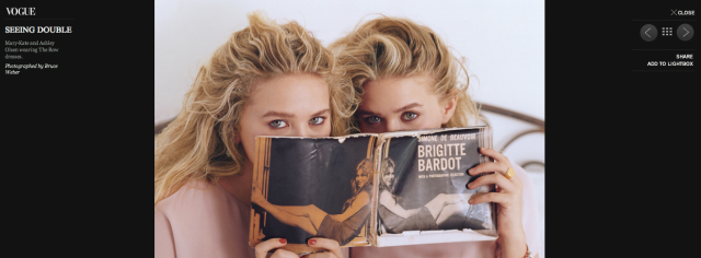
 The best part of the magazine’s site, of course is its level of interactivity. Once the user is in the interior page, they are greeted with the headline, a choice to click to the right or left of the main headline to a new headline story, the option to click through a slideshow below the opening photo, or simply the ability to scroll through the story and read it. For this specific example, I wanted to use a story that was done about how Mary-Kate and Ashley Olsen are grown up and leading a highly successful fashion line. The story was told from both a professional and artistic angle, and it made me look at these young women in a new light. I think that this had a lot to do with the way the story was presented.
Here is my favorite part: When the user clicks on the opening photo or on the ‘See the Slideshow’ option, they are redirected to another interior page that is an entirely different shell, and this acts much like a photo viewer. Here, the reader can look just at the interactive graphics, videos, are photos and read the captions, or even view the photos from a thumbnail setup. It is really user-friendly, and is a great way to digest the stories on the magazine’s site – the reader can exit the photo viewer at any point and return to the story. The reader can use the site and dive into the multimedia without feeling overwhelmed, and is directed through the story’s components with a moderate level of control from the web designer.
The New York Apartment – A History of Vertical Living
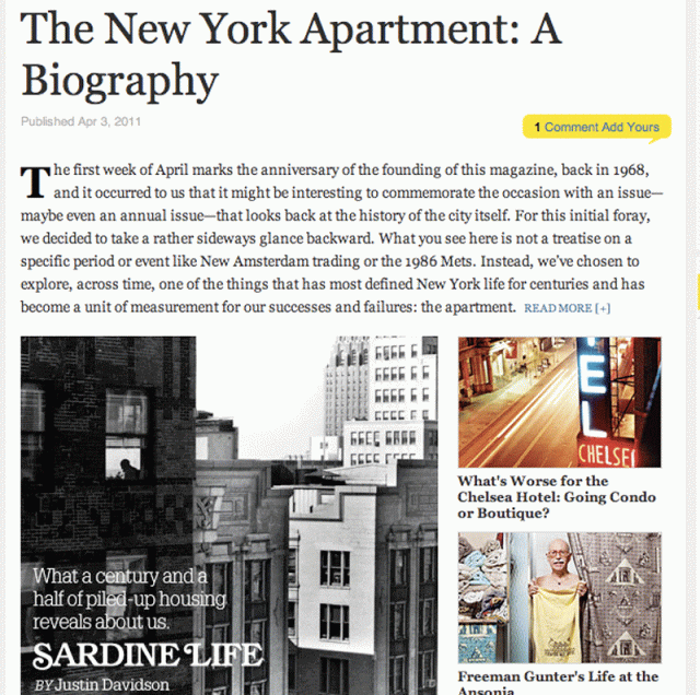
One of my absolute favorite multimedia projects that I have seen lately has been in “New York Magazine.” They did a special about New York apartment living entitled The New York Apartment: A Biography.
It starts out with long text pieces accompanied by photos.
There are several photo slideshows that do a good job of telling other parts of the story. One is about the people living in the Chelsea Hotel and the kind of landmarks they leave behind. Another shows how New York Apartments have been depicted in movies. The one I like shows the most lavish apartments throughout history. These are three elements of the story that are most enhanced by visuals and the slideshows help keep it organized.
The project comes full circle with first person text stories from the magazine’s staff about apartment living.
The project finishes up with a Google map of the “micro neighborhoods” of New York. The map works for this section of the story because naturally when you talk about neighborhoods people are going to want to know where they are.







You must be logged in to post a comment.